Light up my life!
AtmosFEAR
A big part of Update 2 is adding lighting to the world of T-SOL. From the beginning we wanted the game to evoke the feeling of being lost in an unfamiliar place. Light and darkness is a really useful tool to add to the atmosphere of being lost somewhere.

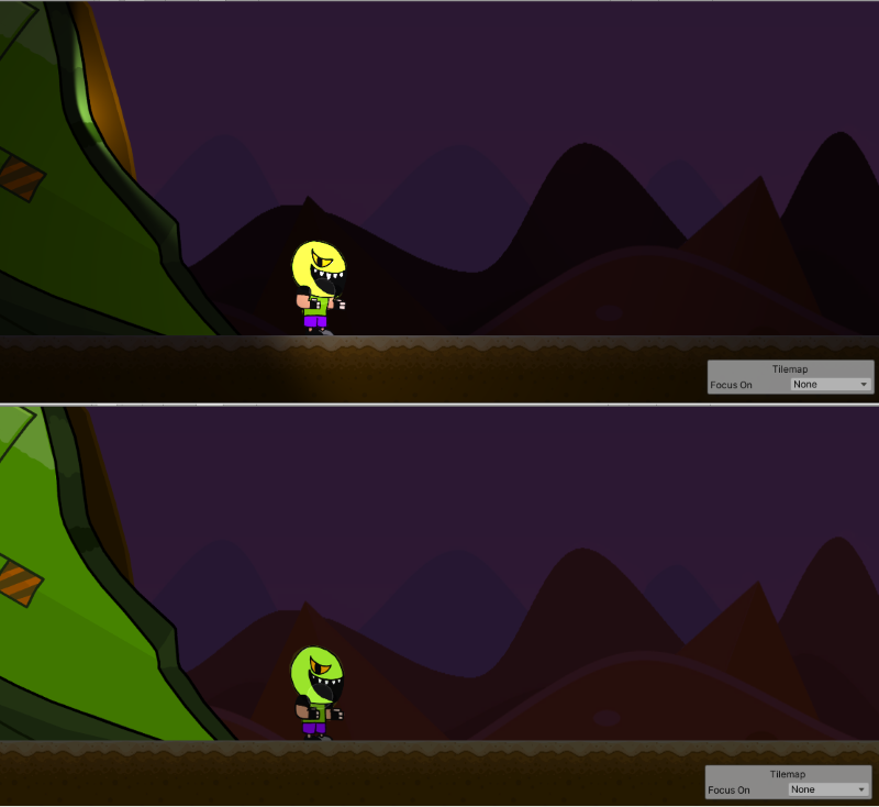
Compare the beginning area with and without lighting. The spaceship emits a bright warm light but also is a dead end. The only way forward is to brave the darkness of the unknown. It's night time and a little difficult to see things. Travel further and Saul is alone. Only the faint glow of Saul's suit pushes back the oppressive darkness. Removing the lighting strips away some of that sense of not knowing what's ahead. The way can be clearly seen and the background is also somewhat flat this way too.
An additional benefit of lighting is in providing little navigational aids. A distant glow can be used to indicate something of interest to the player. Minor actions by the player can change lighting to indicate places that have already been visited and so on. We also are giving important items a glow for added emphasis.
Technical Points
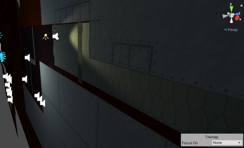
Adding lighting to a 2D game requires a bit of finagling. Lights in Unity3D are 3D objects, natch. To get 2D lights requires pulling in some new experimental stuff which we'd prefer to avoid for now. If you place a light 3D on to a tile map you end up seeing nothing. To work the light needs to be placed a distance backward, away from the level. In addition, we also move the layers of tiles apart. That way the light adds a little depth to the scene by lighting slightly different parts of each layer.

Another side-effect of Unity3D being, well, 3D is that sprites have a "front" which is lit and a "back" which is not lit. The result is that characters facing the wrong way are completely unlit. When facing right the player's "front" is facing the light but when facing left the "back" is facing the light and the light has no effect. There are a few solutions to dealing with this. The most likely fix will be to write a customized sprite shader that will light both the front and back of a sprite.

Finally, a somewhat odd effect. Sprites that are part of the same "layer" for sorting will appear to be transparent on top of each-other. You can see this in the top part of the screenshot below. This effect goes away when sprites' drawing order is set manually. But that is tedious and we are lazy!
The issue is with how lit pixels get drawn. Each sprite contributes its own lit color to the overlapping pixels. Piling enough sprites on top of each other will produce a blindingly bright smear. Our likely solution is to treat the sprites more like 3D objects in a custom shader. Each sprite would write to what is called a depth buffer. The next sprite drawn would test the buffer and not be rendered if another sprite was drawn in that location. Hopefully the result will look like the bottom in the comparison below.

Our next step will be writing a customized sprite lighting shader that fixes the bugs above. Stay tuned for another update in a week or two!
Get T-SOL - Early Access Demo
T-SOL - Early Access Demo
An accident has left Saul marooned on an unfamiliar planet. Help get Saul home!
| Status | In development |
| Authors | Bird With Toes, Tofski |
| Genre | Platformer |
| Tags | 2D, Metroidvania, Short |
More posts
- Update 5 NOW AVAILABLE!Sep 10, 2023
- Plans for Update 5Aug 01, 2023
- Unity 2D Animation with Fancy Lighting!Aug 01, 2023
- Update 4 Released Development ResumedJul 16, 2023
- Customized Tiles in UnityJun 21, 2021
- The Light of Forgotten PromisesJun 01, 2021
- Plans for Update 4May 10, 2021
- Update 3 now Available for Download!May 04, 2021
- Update 3 will be available Tomorrow!May 03, 2021
Leave a comment
Log in with itch.io to leave a comment.