Animating Saul: A Crash Course on MechAnim
Dan here! With a large part of Update 3 being about animating Saul better I think animation would be a good topic to blog about. Strap in, this is going to be a long one!
Originally the artwork for Saul was done by Logan. I love the chibi character but, unfortunately, trying to aim anywhere other than straight ahead looks a bit weird. I also want Saul to be able to fall through one tile wide gaps which also looks weird with the chibi design. So we needed to re-work Saul a bit. Unfortunately, due to other commitments, Logan is no longer available to produce art for T-SOL. That means I'm doing the art now.
The drawing process for Saul is largely the same as what I used for enemies. Click here for more on that! The only real change is that I've got my hands on a light box so I can produce better pencils. This has reduced the amount of weirdness I need to fix after importing into Unity by a lot. But I digress. What I want to talk about is the more technical side of things. How the drawings are translated into behavior. Let's start with the big picture.
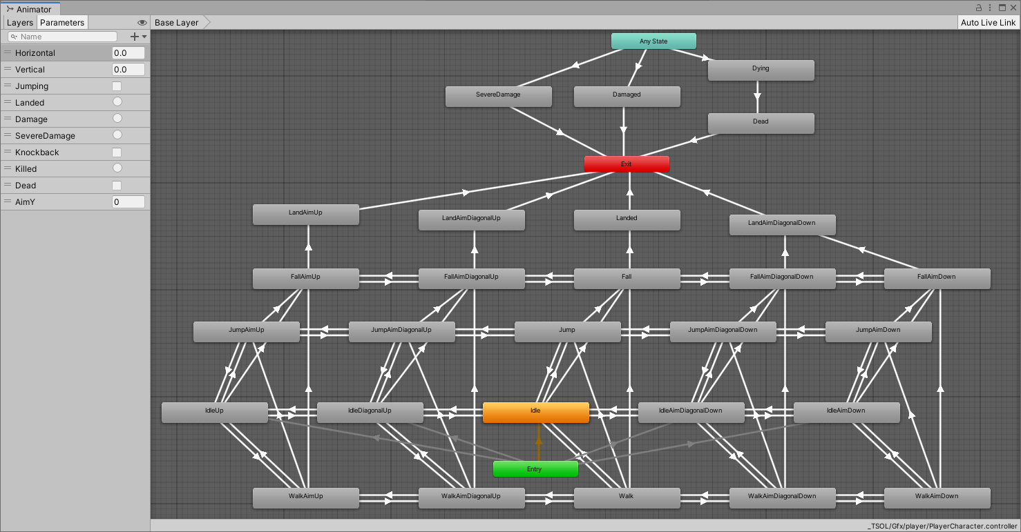
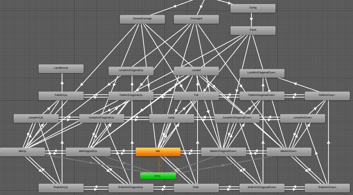
The picture above is the Animator Controller for Saul. You can find Unity's docs on them here. Looks a bit overwhelming zoomed out like this, eh? Every box shown is called a State and every State has an animation that goes with it. The arrows show what are called Transitions. Transitions are the real meat of the Animator since they're how Unity decides what gets shown and when. You can find more about Transitions here. While this looks like a tangled mess zoomed out you may see a repeating pattern. Let's zoom in a bit.
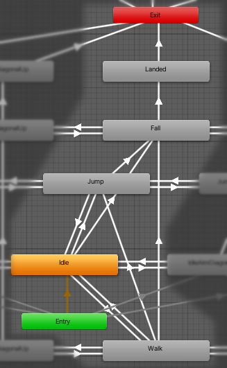
This is the core of Saul's animations. When the game starts Unity decides what animation to show using the transitions from the Entry box. If no other animation fits then Saul starts in the Idle state. That's why it's bright orange. From the Idle state Saul can change to the Jump, Walk or Fall states. The way Unity decides which transition to run is done by Conditions in the Transition. Let's look at the one for Idle to Walk.
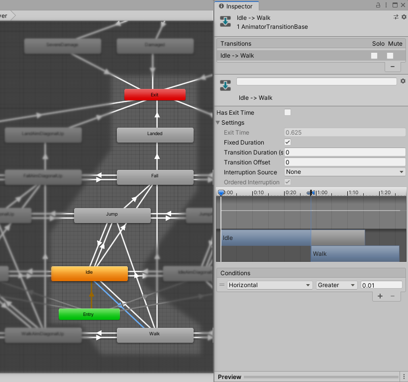
The Condition references a Parameter called Horizontal. This is where the game's code can control the animation of Saul. When Saul walks the game's movement code sets the parameter Horizontal to equal Saul's walking speed. When it's above 0.01 Unity starts the transition. Note the unchecked Has Exit Time checkbox. When this is turned on the Transition will wait until a specific point in Idle's animation before actually beginning to change to the Walk state. This makes the transition less jarring but also delays it which can feel unresponsive. By having it unchecked we tell Unity to start the transition to Walk immediately. Since the Transition Duration value is set to zero seconds the Transition completes instantly and Saul enters the Walk state the instant the player starts moving.
A little more complexity comes into play when we add vertical movement. Saul can jump from any state and can fall from any state.
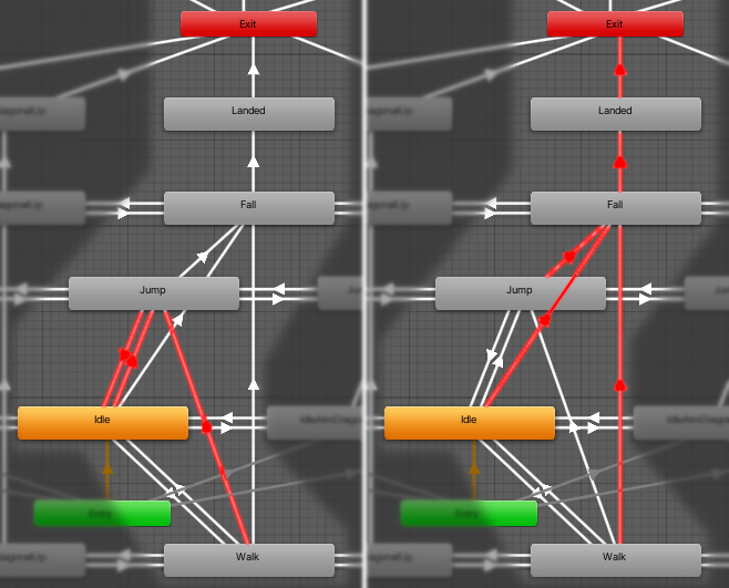
You may have noticed that there are no transitions from the Fall state back to the Idle state. This is because Unity's Animator provides a magic state called Exit. That's the red box you can see in some of the pictures above. In a basic Animator the Exit state is a quick way to return back to the Entry state. So, when in the Fall state the Animator has a transition to the Landed state followed by a transition to Exit.
The transition from Landed to Exit has Has Exit Time turned on and the Exit Time is set to 1. This tells Unity to wait for the entire animation to finish before returning Saul to the Idle state. Here's the result in slow motion
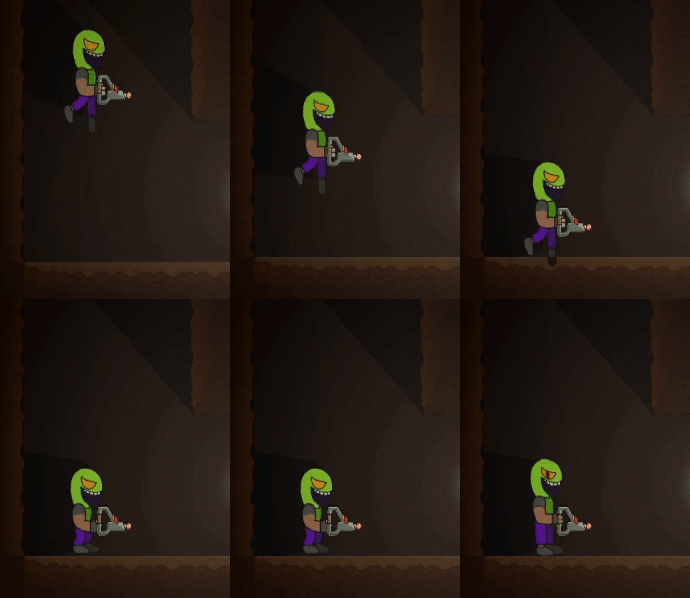 | 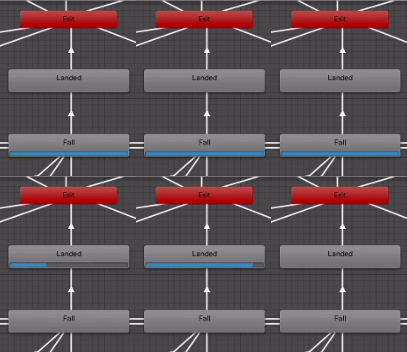 |
Ok. That explains the basics. But where do all those other boxes come from in the zoomed out view? Short answer: aiming. Since Saul is hand animated there are dedicated animations for all directions of aiming that are allowed. This works out to repeating the same set of Idle, Walk, Jump, Fall and Landed states five times. The remaining states, at the top, are for when Saul is hurt or killed. This is where using Exit comes in handy. Without it I'd need transitions from the damage and death states at the top of the controller. I'd need more for all the Landed states as well. It would make the animator a nightmarish tangle of arrows pointing everywhere. Kinda like this but worse
Before signing off I wanted to leave you with one last bit of info on how aiming is done. In previous versions we had an object called GunRoot which was rotated as the player pushed the aiming buttons. This left the gun floating in odd places when aiming anywhere but ahead. GunRoot is still around but now, instead of manually rotating it, the animations decide where to put it. The aiming component sets a parameter in the Animator which triggers transitions between the different aim states. Those transitions are highlighted here. Again in slow motion.
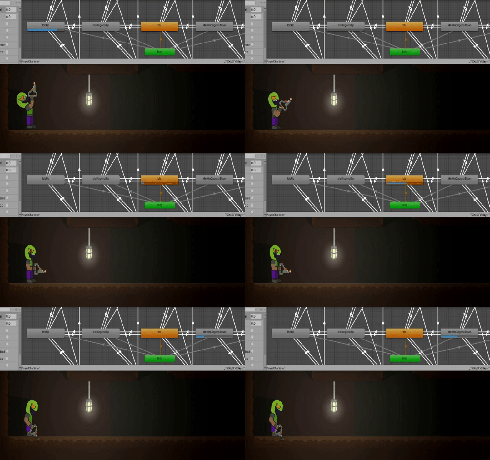
Here's the code that triggers those transitions.
    void FixedUpdate()
    {
        int aim = 0;
        if (player.GetButton(Aim45DownInput))
        {
            aim = 1;
        }
        if (player.GetButton(Aim45UpInput))
        {
            aim -= 1;
        }
        if (player.GetAxis(VerticalInput) > 0.5f)
        {
            aim = 2;
        }
        else if (player.GetAxis(VerticalInput) < -0.5f)
        {
            aim = -2;
        }
        animator.SetInteger("AimY", aim);
    }
And with that I bid you Adieu. Next blog will have some pretty pictures showing some of the changes to lighting we're working on right now.
Get T-SOL - Early Access Demo
T-SOL - Early Access Demo
An accident has left Saul marooned on an unfamiliar planet. Help get Saul home!
| Status | In development |
| Authors | Bird With Toes, Tofski |
| Genre | Platformer |
| Tags | 2D, Metroidvania, Short |
More posts
- Update 5 NOW AVAILABLE!Sep 10, 2023
- Plans for Update 5Aug 01, 2023
- Unity 2D Animation with Fancy Lighting!Aug 01, 2023
- Update 4 Released Development ResumedJul 16, 2023
- Customized Tiles in UnityJun 21, 2021
- The Light of Forgotten PromisesJun 01, 2021
- Plans for Update 4May 10, 2021
- Update 3 now Available for Download!May 04, 2021
- Update 3 will be available Tomorrow!May 03, 2021
Leave a comment
Log in with itch.io to leave a comment.